Last night, I posted about President Trump extending the federal guidelines for another month:
It appears that the model was produced by a team led by Chris Murray, the director of the Institute for Health Metrics and Evaluation at the University of Washington.

The model was released on March 26th and is being updated regularly. However, the model’s predictions are materially overstating what the actual data is showing:


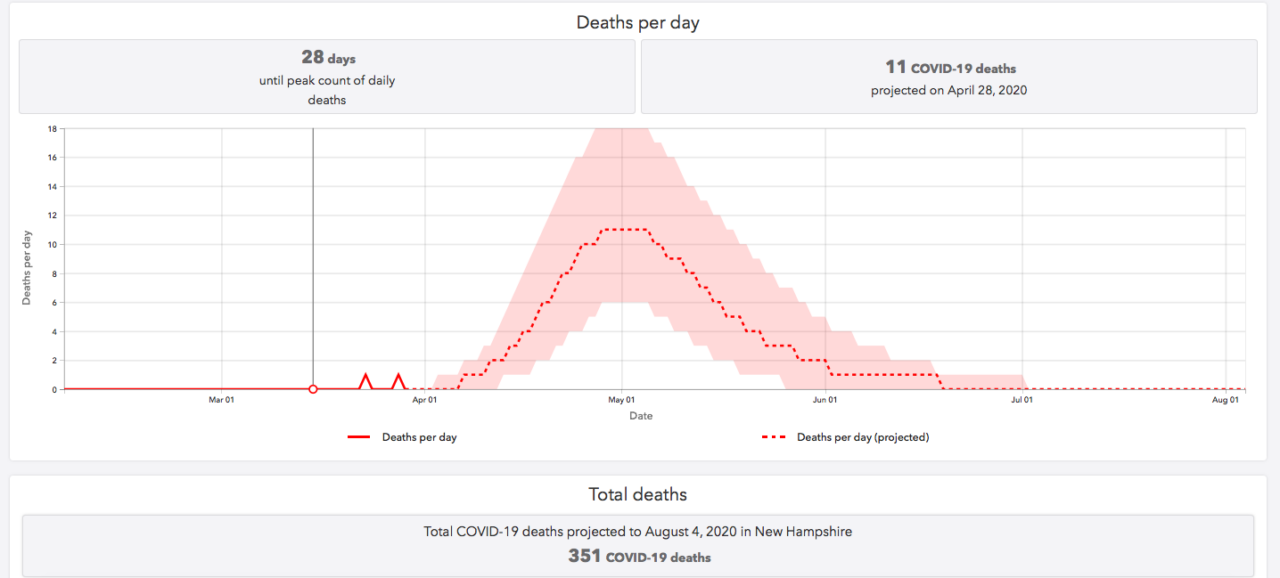
Here is the Murray model’s prediction for Coronavirus deaths in New Hampshire:

The model assumes that the current shutdown continues. So it is saying that New Hampshire has to remain in shutdown until at least sometime in June. It is unclear if the model is saying the the shutdown has to remain in effect longer than that to keep the mortality rate tracking as depicted on the graph.
Deaths in the United States are supposed to peak on April 15th, per the Murray Model. New Hampshire deaths, however, aren’t supposed to peak until two weeks later. I was unable to find any explanation for the different projections.
I was also unable to find any explanation for why the death rate is zero for the entire month of March and then jumps to eleven deaths per day by late April. The data we have to date is not suggesting … at least to me … the upsurge the Murray model is predicting:

On March 17th, 4.6% tested positive (17/372). On March 30th, 4.9% (258/5,252). The mortality rate is about 1%.
At the same mortality rate, there would have to be 35,000 positive cases over the next two months. If we continue to see 40 or 50 new cases every day (which is what we have been seeing recently) that is only 3,000 new infections … or 30 new deaths. A far cry from the 351 projected.
We deserve to know the following information:
Is New Hampshire using the Murray model? What assumptions does the model use to project 351 deaths? Only then we can start talking about whether these assumptions make any sense, and whether it makes any sense to base public policy on a model using these assumptions.
