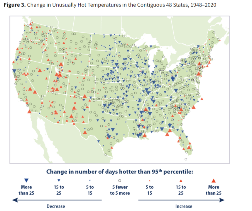
The Environmental Protection Agency (EPA) has a Climate Change Indicators page that we expect will be getting a rehab any day now. When yo select change in hot temperatures it produces a map that contradicts the others on the page.
From the CO2 Coalition.
As reported by EPA, only 19% of all weather stations report an increase in the number of hot days since 1948!
Below is an important chart that somehow slipped by EPA’s “consensus” censorship squad. It is a map of all 1,066 weather stations across the United States. The change in the number of hot days for that station are ID’d as increasing (red), stayed the same (blank) or decreasing (blue).
A total of 863 stations, or 81%, reported either a decrease or no change in the number of hot days! Any guesses on how long this map will remain up on their site?
The significant number of stations compromised by encroaching heat islands makes me wonder two things. Are all 19% of the stations showing an increase so encumbered, and how many of the others are as well?
That doesn’t change the public relations hitch this puts in the Climate Cults Global Warming Step. It’s inconveninet, but not devastating. They’ve survived all the apocalyptic predictions that never came to be while predicting more, so this can’t be much of a concern. But I do expect the map to change or the data to be tweaked so it presents a result aligned with the current dogma.

