
On Tuesday, August 14, at 6 pm, there will be a discussion about school funding at Richards Elementary School in Newport. The discussion, which will center around a report created by the (recently shuttered) New Hampshire Center for Public Policy Studies, will be led by Executive Councilor Andru Volinksy, and John Tobin.
(You’ll remember them as the attorneys who helped the New Hampshire Supreme Court conclude that it is ‘essential to the preservation of a free government’ to give that government a monopoly on education… relying on a constitutional article that says it’s the government’s job to protect the public from monopolies.)
Much of the discussion in the report centers around this graph,
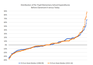
and the conclusion that they draw by looking at it:
If one of the goals of Claremont was to increase per pupil spending equity, Figure 1 suggests that there has been virtually no change.
The reason it suggests this is because the way the graph was constructed is misleading. What you’re supposed to think is that if you draw a vertical line somewhere in there, it will connect the old and new spending levels for a particular school district. But this isn’t the case! This is really an overlay of two separate graphs, with the districts in two different orders. The picture below illustrates what’s actually happening, using two towns as examples:
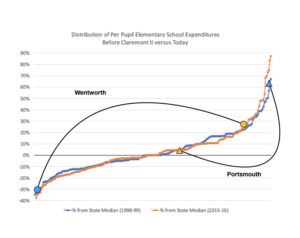
If we align the schools vertically, we get a much different picture of things:
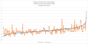
That is, relative spending has changed everywhere, in both directions, often by considerable amounts.
And if, instead of looking relative amounts (percentages relative to the median), we look at the absolute amounts (adjusted for inflation), the picture looks like this:
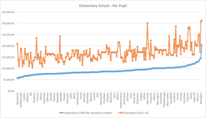
This makes it easier to see that spending has not just changed, but soared, in every district — rich and poor, urban and rural. Again, adjusted for inflation, most districts in 2015 were spending more per pupil than the richest districts were spending in 1998. This is the legacy of Claremont.
And what have we got to show for these spectacular increases? Have we seen corresponding increases in test scores? In the number of students at proficiency? In graduation rates? Has anything increased significantly, other than expenditures?
Might we have seen exactly the same amount of improvement in public schools if we had just piled up all that extra money and set it on fire? The evidence suggests that this is the case. So we should be skeptical about any arguments that more expenditures will lead to better outcomes.
The lesson of Claremont seems to be that where education is concerned, money is not the issue. Remember this old joke?
A policeman sees a drunk man searching for something under a lamppost and asks what the drunk has lost. He says he lost his keys and they both look under the lamppost together. After a few minutes the policeman asks if he is sure he lost them here, and the drunk replies, no, he lost tit in the park. The policeman asks why he is searching here, and the drunk replies, ‘the light is better here’.
This is what we’re doing when we focus our discussions about how to improve schools primarily on money. Which, of course, is precisely what Messrs. Volinsky and Tobin will be doing at this meeting.
Now, to return to that first graph for a moment, we can ask: Is this just an honest mistake? Well, here’s another piece of evidence to suggest that it might be. In one part of the report, they say that if state spending decreases by 10%, local taxes would have to increase by 10% to compensate.
Now, even students who haven’t had any algebra should be able to see that this is wrong. Here’s a diagram that illustrates why:
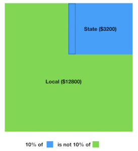
To replace a decrease of 10% in the smaller amount (state aid) would not require an increase of 10% in the larger amount (local taxes).
There are other pretty basic errors as well, including omissions of data points. Which leads us to ask: Are these guys just bad at math? If that’s the case, then since their conclusions are all driven by a mathematical analysis of data, perhaps we’d be better off just ignoring those conclusions.
But one of the authors, Greg Bird, has a master’s degree in economics from Temple University. So we might need to set aside the ‘honest mistakes’ explanation, in favor of something darker, i.e., that the authors are aware of the misrepresentations, but expect that their audience won’t notice.
After all, as you can see here, the Union Leader took the bait. Why wouldn’t they expect you to, as well?
(Thanks to my wife Jody Underwood for insights, graphs, and proofreading. It should be a lively and interesting meeting. We live on a farm with chickens, so we can bring a bag of feathers. Who can bring some tar?)