
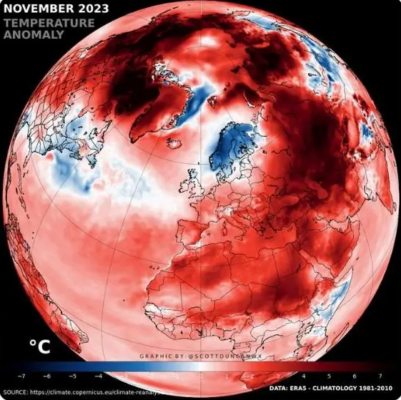
From the hottest hotness ever files. Look at that picture of the earth. Nearly everything is red—a dark, muddy-looking red. And red is bad. Red is hot. Red is…a color anyone can apply to fool people into thinking something that is not true.
This image, in particular, is interesting because of the accompanying text in the original tweet compared with reality.
We just observed the warmest November on record for the global average temperature.
We can still find areas of extreme cold in a warming world. pic.twitter.com/fkHGHhDdod
— Scott Duncan (@ScottDuncanWX) December 6, 2023
Tony Heller went and pulled the temperature data from the Danish Meteorological website.
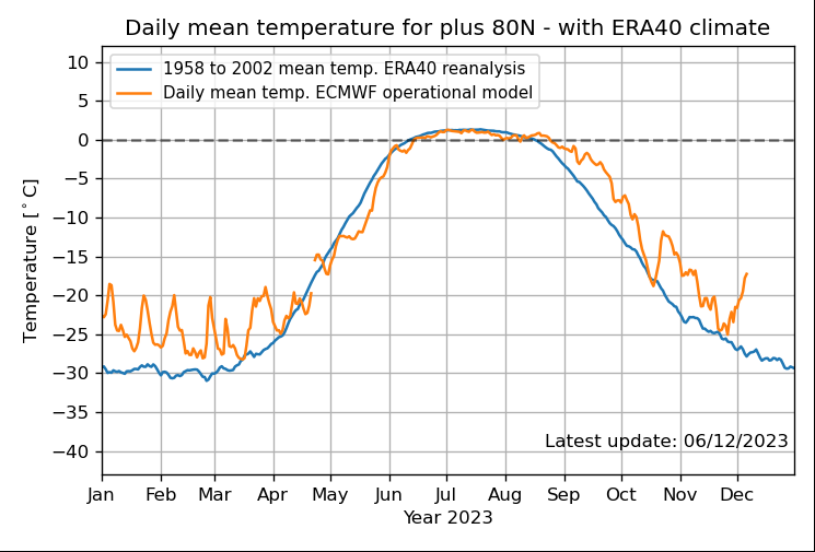
The average temperature to which this scary red image related was somewhere between -15 and -20°C. The average of these averages, for you fans of Farenheight, is Zero degrees.
Have you ever been outside when it’s zero degrees Fahrenheit? Do you picture a muddy red map and the words ” warmest” anything?
Is it “warmer” than normal? Yes! Is it above the mean? It sure is. Is that graphic insanely misleading? Definitely.
As is the predictable hottest hotness ever narrative, which we’ve debunked more times than I can count or share. The Climate Cult lies so badly and so often that the truth becomes impossible to glean, and that’s the point. By systemically misleading everyone about everything, serial liars protect their narrative and muddy up the debate.
There is nothing red-hot about zero degrees, but that’s the picture they will paint if it will separate people from common sense so they can pry their money away from them for their ridiculous cause: the idea that, even if there was a man-made impact they would or could do anything about it but rob people blind.